ICON
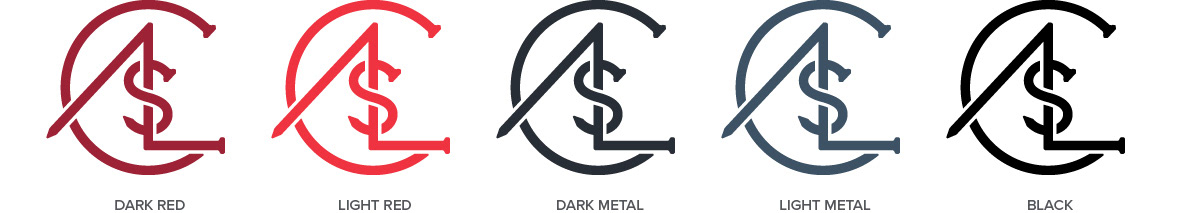
Logo
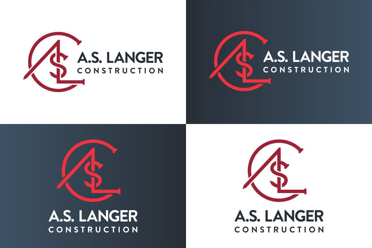
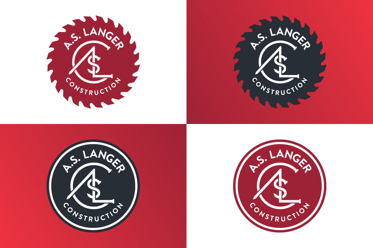
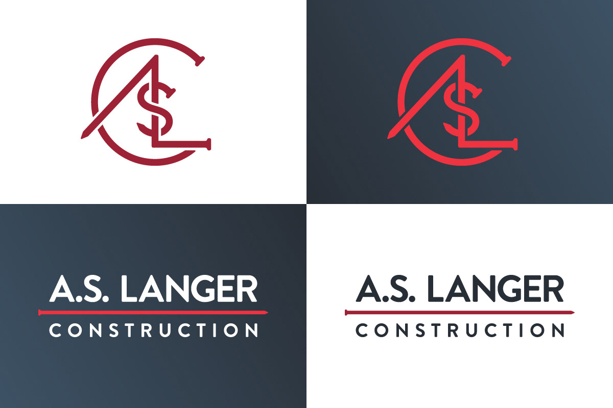

A.S. Langer Construction is a residential contractor that designs and builds custom solutions for peoples homes. When they came to me to help design a new brand identity I took my inspiration from the tools and materials of the trade. In the monogram icon I incorporated the head and point of a nail into each letterform. The curves of each piece of the icon match with the typeface chosen for the full logo, creating a unity between graphic and text. The visual link to construction continued to build thru multiple alternate logos, including a saw blade badge and nail / type only treatment.